Types
| name | description |
|---|---|
task |
A task has a solution which needs to be solved. After solving the following elements get released. |
info |
An info element has no solution and is automatically acknowledged if the element is seen the first time. After acknowledging the following elements get released. |
choice |
A choice can have multiple following elements and the user has to decide where to go. Choices can only be processed once. After choosing the choosen following element gets released. |
coin |
A coin is not part of the story graph and can be collected once within a session from anywhere. |
dynamic |
A dynamic element can be processed multiple times and can lead the user to a different following element each time, depending on the return value of the related script. |
Add new
To add a new element select the type, enter the name and click on the button add new element.
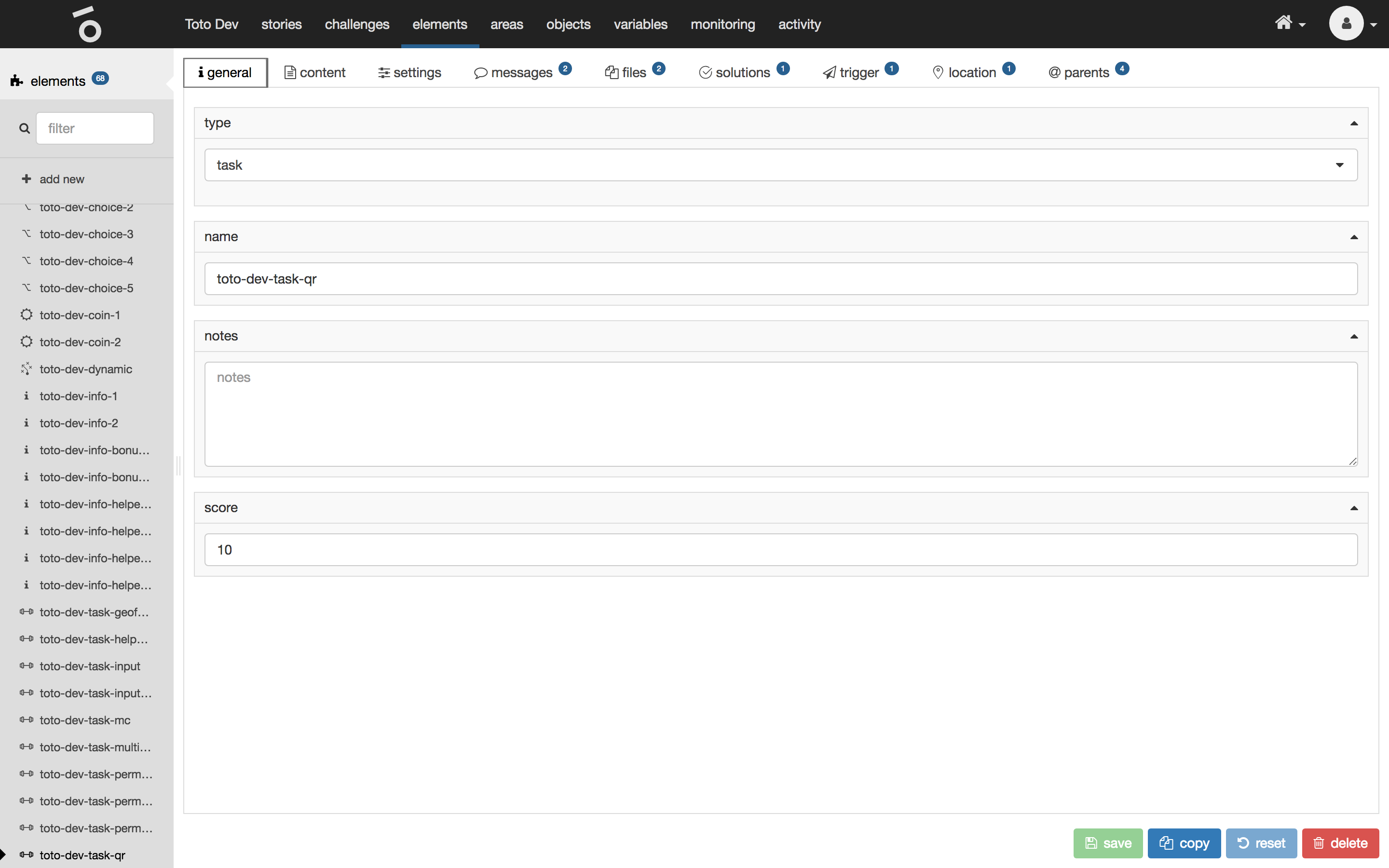
General
The general tab of a selected element shows the following properties:
| name | type | description |
|---|---|---|
type |
selection |
Type of the element (task, info, choice, coin, dynamic). |
name |
text |
Unique name which is used internally (unique in scope of all elements). It is shown in the list of all elements in the left hand menu of the interface. Users do not see the name. |
notes |
text |
A comment which is used internally. Could be helpful when working collaboratively. |
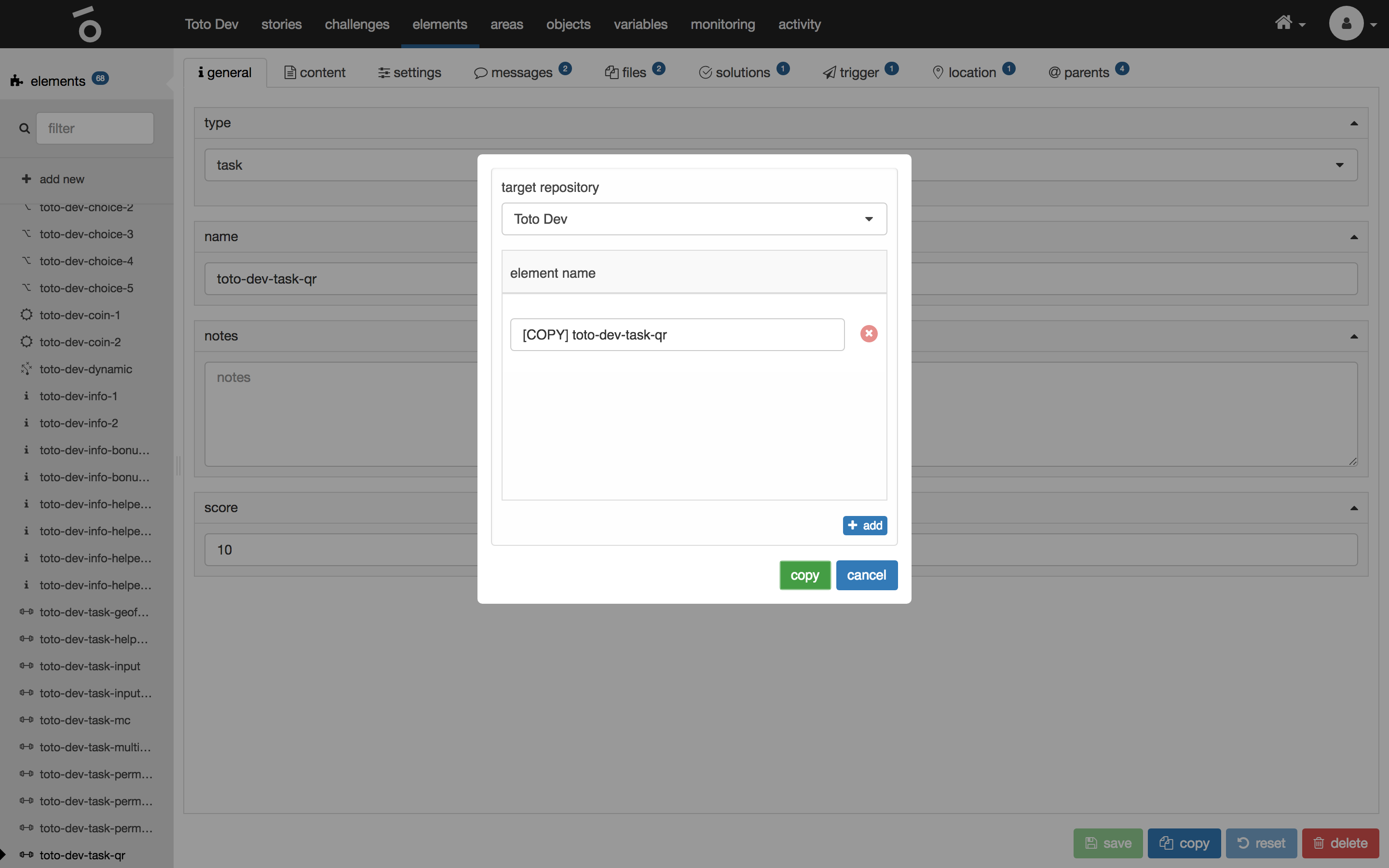
Copy the element to the same or any other accessible target repository by clicking on copy at the very bottom.
Content
The content tab of a selected element shows the following properties:
| name | type | description |
|---|---|---|
title |
multi-language text |
Title of the element. |
description |
multi-language markdown |
Description of the element which is accessible to the user after the element has been released. |
post description |
multi-language markdown |
Another description which is accessible to the user after the element has been processed. |
choice description |
multi-language text |
This text is used within a choice which relates to this element as a choice. |
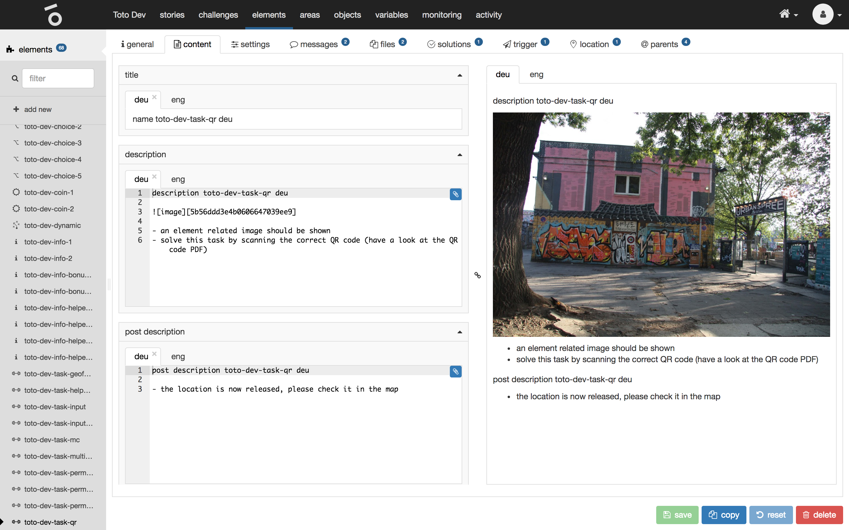
The preview of the description and post description can be seen on the right hand side.
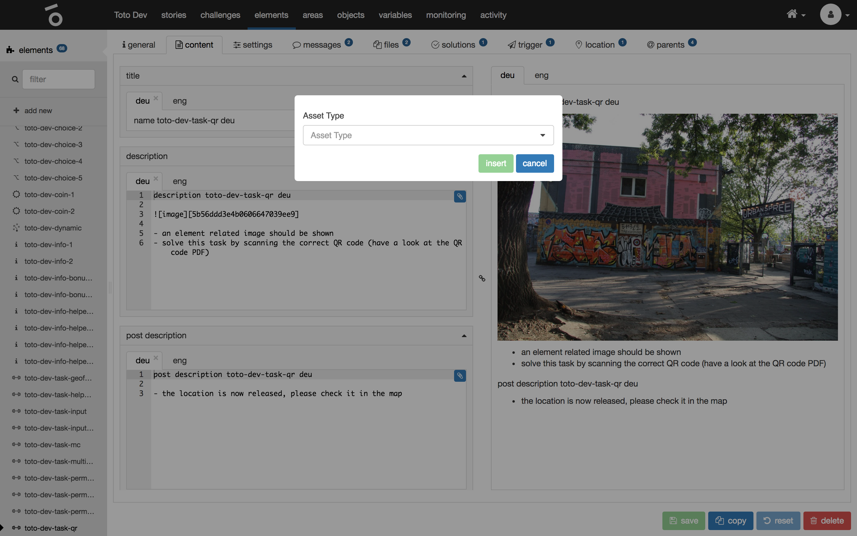
Insert a specific markdown asset to the description or post description by clicking on the little paperclip button of the particular markdown i18n field.
Manual trigger
If a manual trigger is defined for an element you need to explicitly embed it into your content via a special markdown snippet.
![button][<button title>][action:manualTrigger]
Example
![button][Turn on light][action:manualTrigger]This will render a button with the label Turn on light into the apps content
Settings
The settings tab of a selected element shows the following properties:
| name | type | description |
|---|---|---|
show in element list of challenge view |
check |
Defines wether the element is shown in the list of elements in challenge view. |

Messages
The messages tab of a selected element shows the following properties:
| name | type | description |
|---|---|---|
success message |
multi-language markdown |
Custom message that is displayed to the user on processing an element. If no custom entry is added the default Toto success message is shown. |
show success message |
check |
Defines if a success message is shown at all. |
error message |
multi-language markdown |
Custom message that is displayed to the user on failing to process an element. If no custom entry is added the default Toto error message is shown. |
show error message |
check |
Defines if a error message is shown at all. |
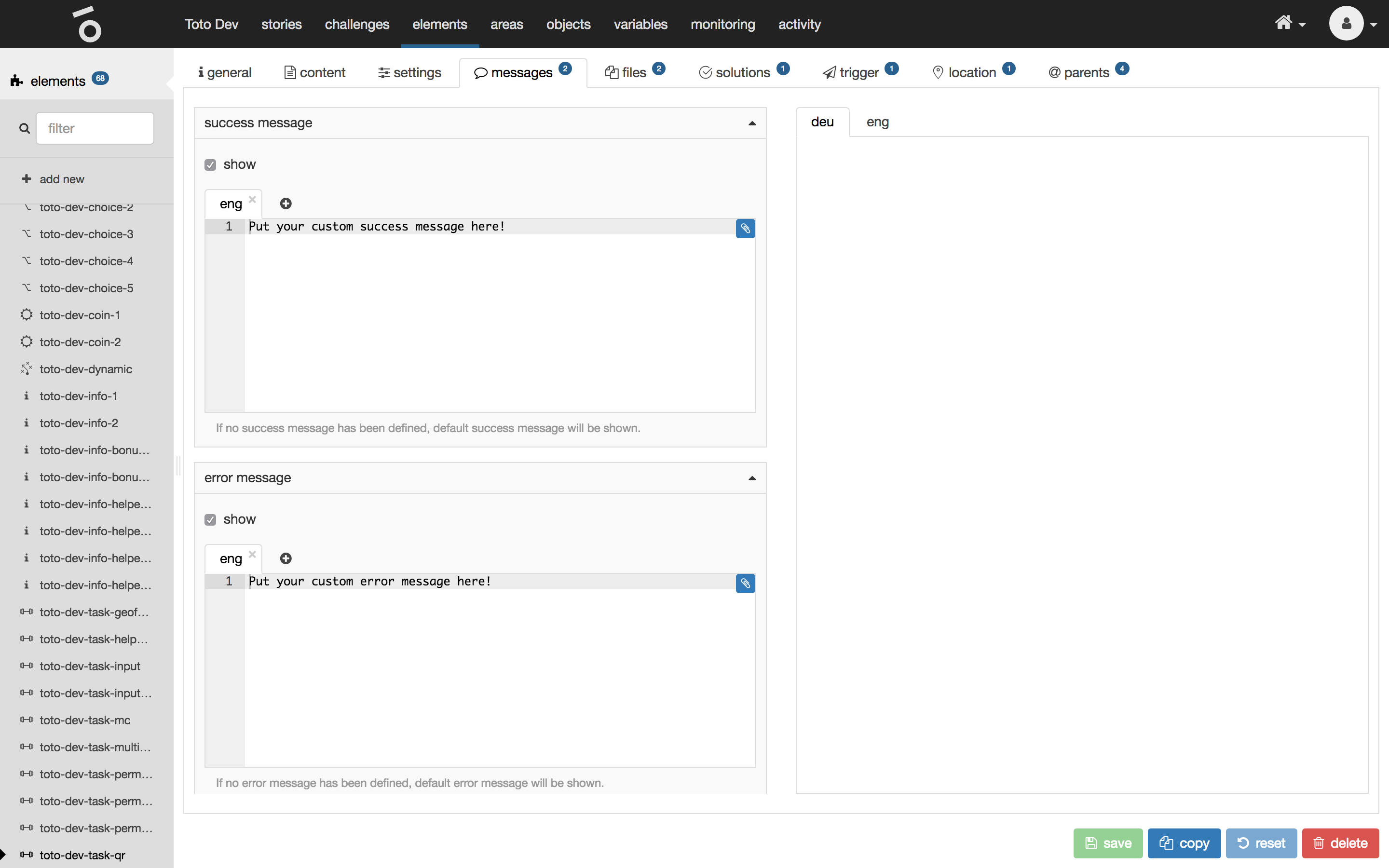
The preview of the success message and error message can be seen on the right hand side.
Files
The files tab of a selected element shows a list of element related files. These files can’t be used outside of the element.
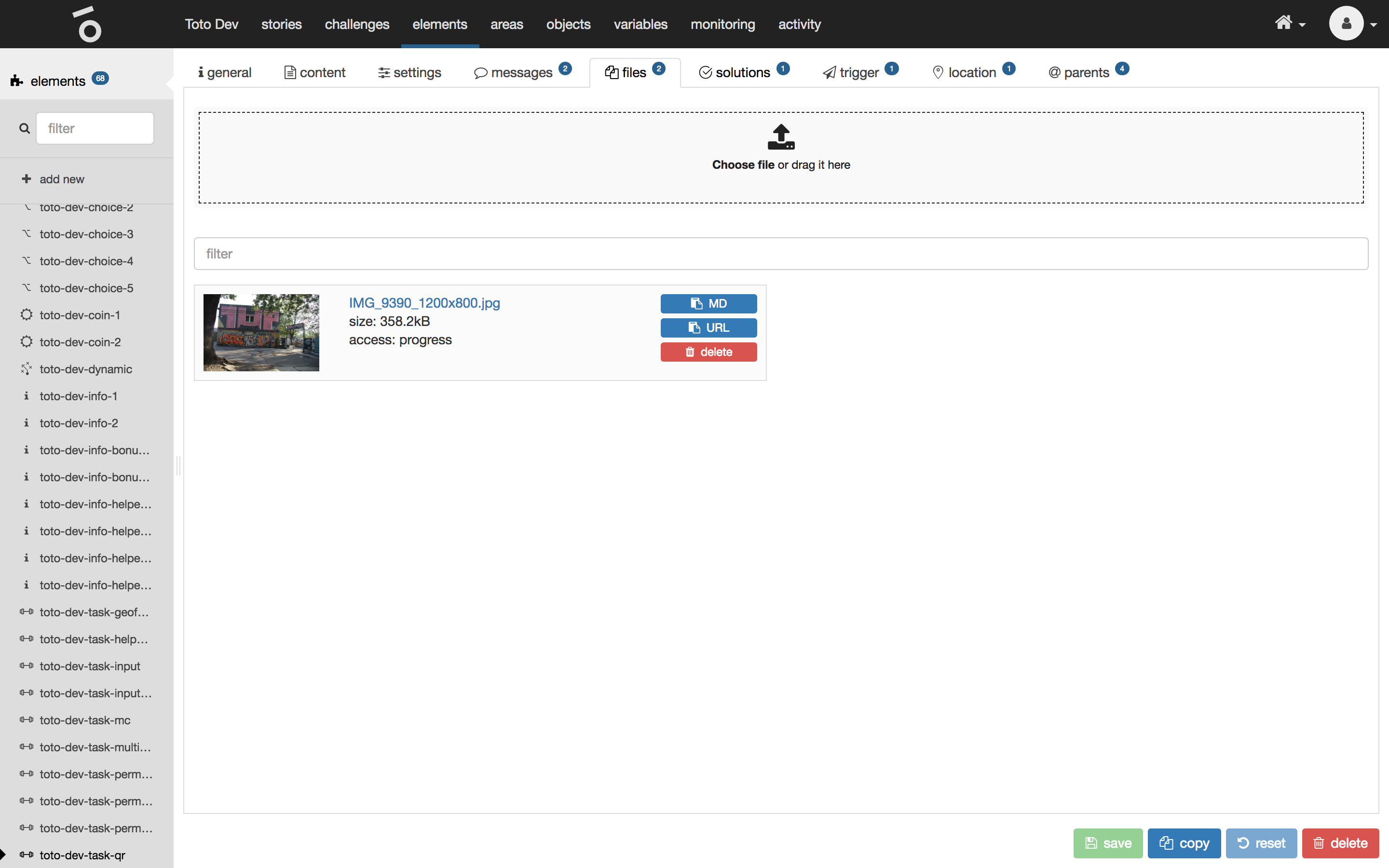
Upload a new file by clicking on the button choose file at the very top or by dragging a file on to that button. The file will appear in the list after being uploaded.
Copy the markdown snippet for including this file into any markdown field of the element by clicking on the button MD of the specific file.
Copy the url of the file by clicking on the button URL of the specific file.
Delete the file by clicking on the button delete of the specific file.
Solutions
The solutions tab of a selected task shows all solution types available for the element.
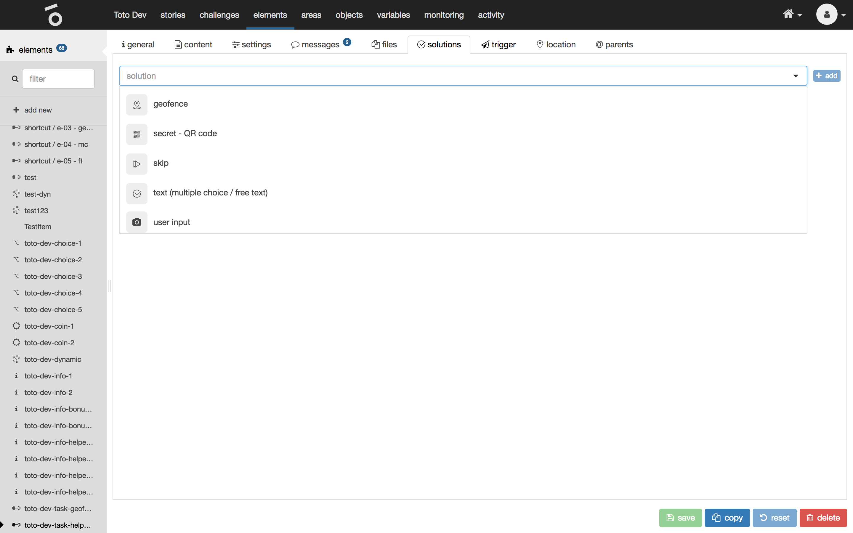
To add a new solution type select solution type from the list at the very top and click on the button add.
Note
You can add multiple
solution typesfor onetasksimultaneously.
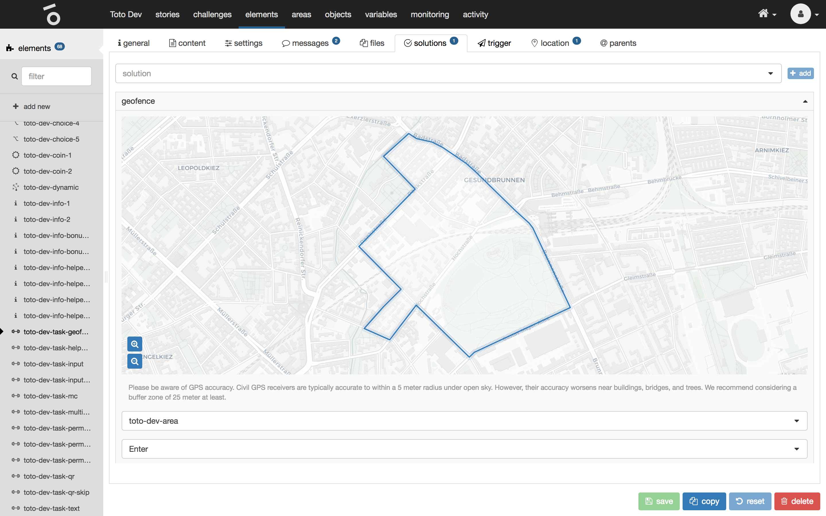
Geofence
A geofence/area needs to be entered or left to solve the task. The geolocation of the user needs to be uploaded for validation which has to be done manually by the user.
| name | type | description |
|---|---|---|
area |
selection |
Defines the area which needs to be entered or left. |
event |
selection |
Defines the event:
|
User input
User input has the following properties:
| name | type | description |
|---|---|---|
text enabled |
check |
Defines if a text input field is shown where the user can type in his solution. |
text required |
check |
Defines if the text input field is required. |
image enabled |
check |
Defines if a image upload field is shown where the user can upload his solution as an image. |
image required |
check |
Defines if the image upload field is required. |
Either a text or image input needs to be activated and required. There can’t be no solution input at all.

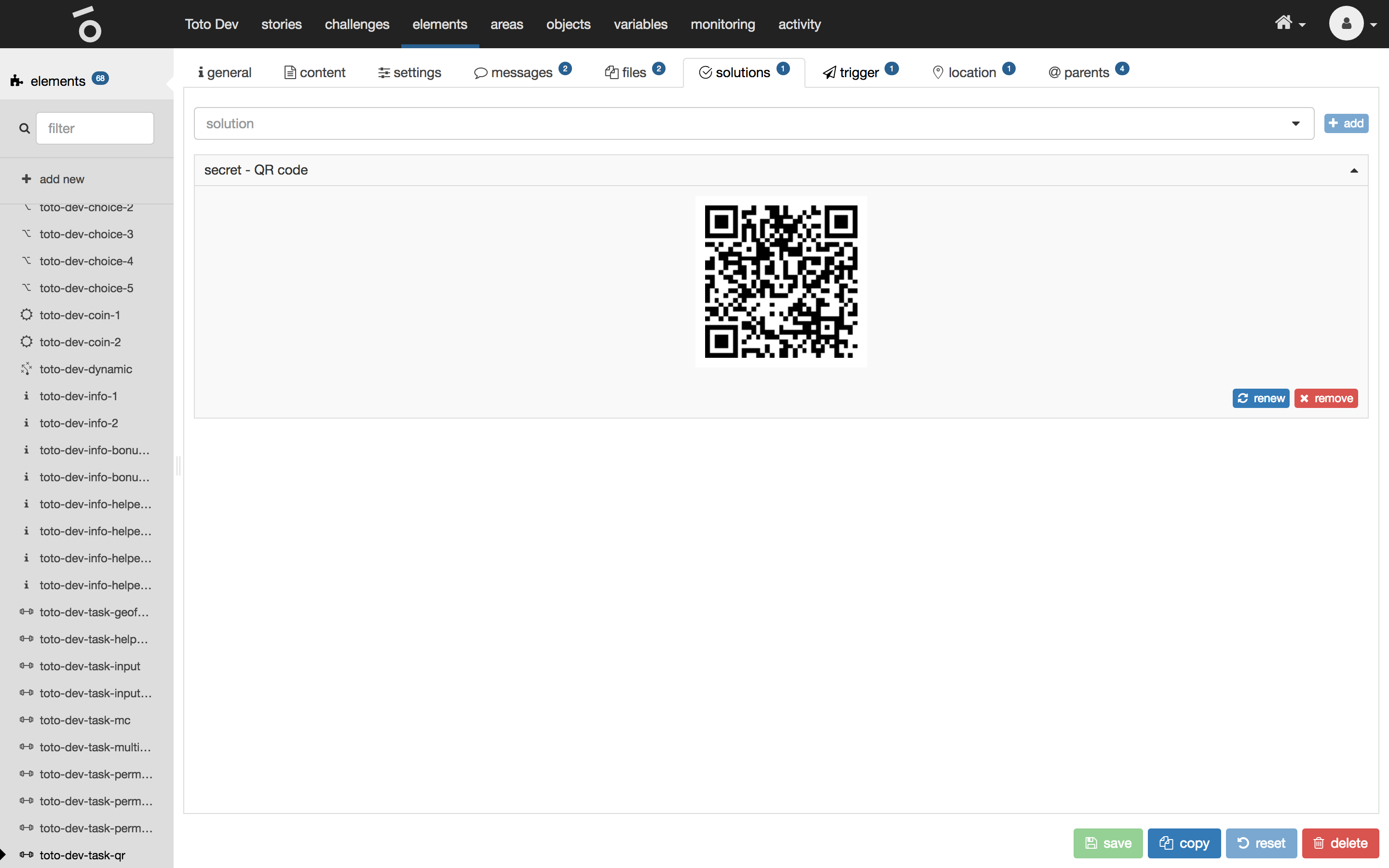
Secret - QR code
A QR code needs to be scanned and processed by a Toto client running on the user’s device to solve the task or collect the coin.
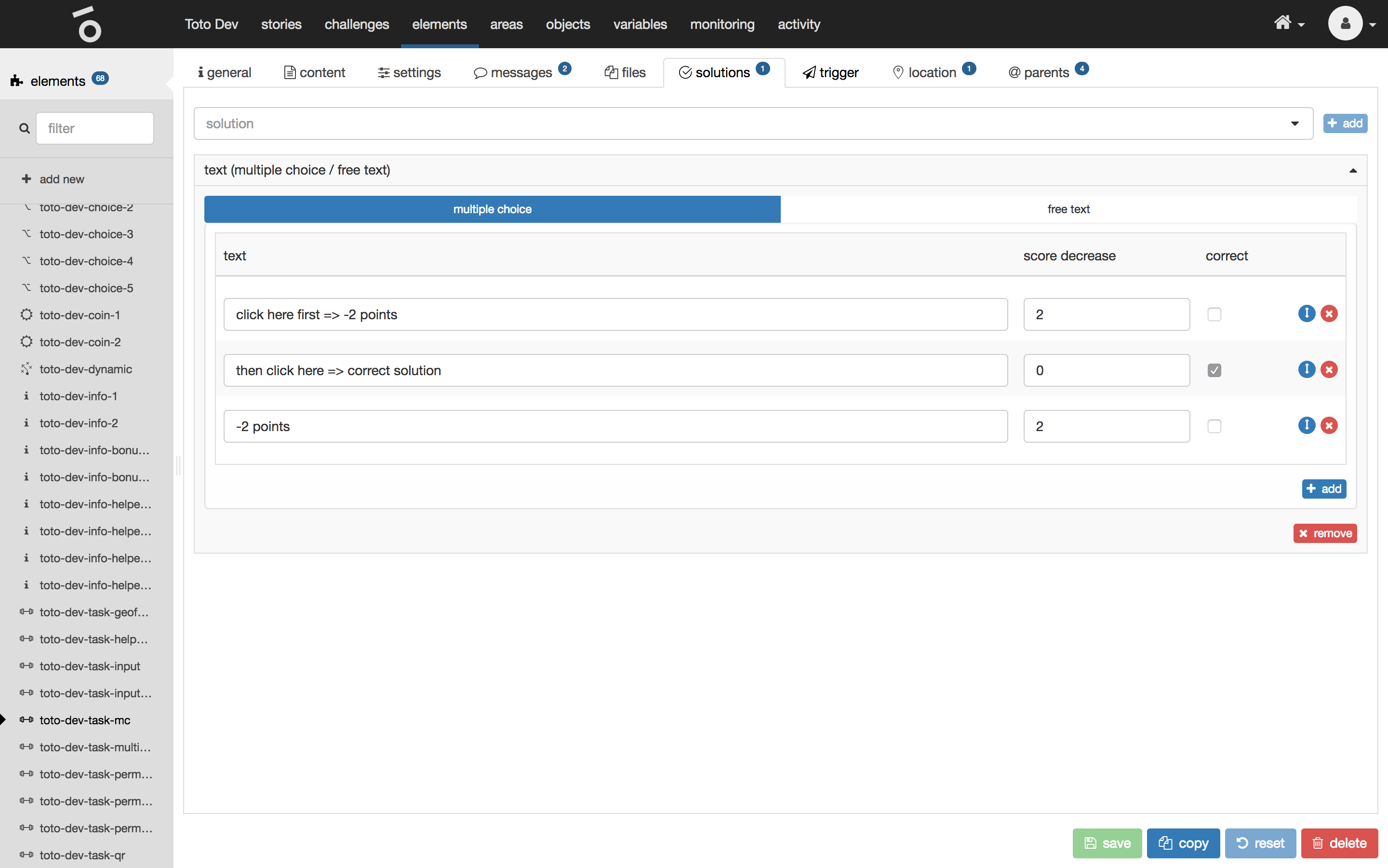
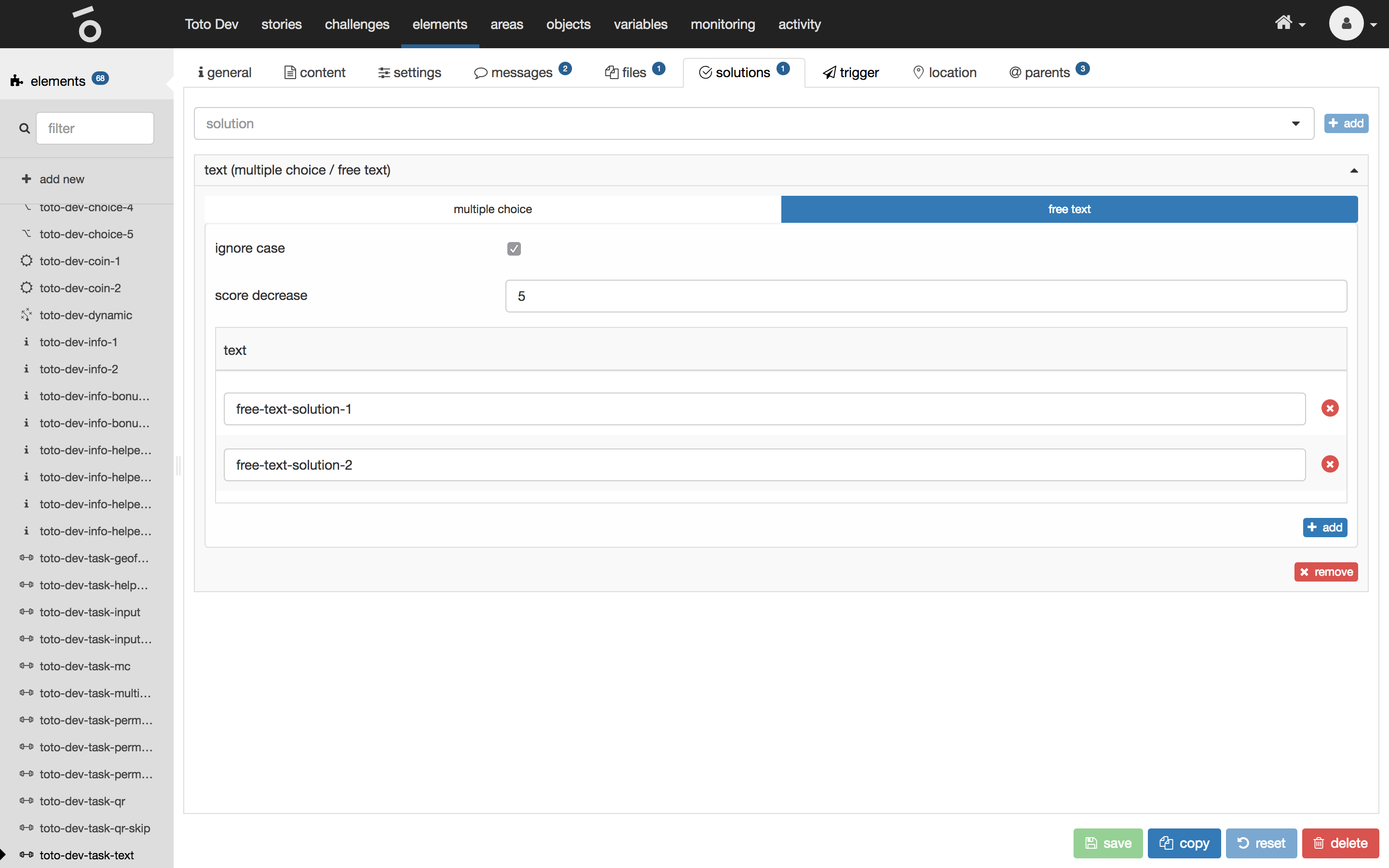
Text (multiple choice/free text)
Here you can choose between a multiple choice or a free text solution.
Multiple choice
Every option of a multiple choice solution shows the following properties:
| name | type | description |
|---|---|---|
text |
text |
Defines the text to show for the multiple choice option. |
score decrease |
number |
Defines the amount of points to deduct from the user’s total score if the user picks this (wrong) multiple choice option. |
correct |
check |
Defines if the multiple choice option is a correct solution. |
Reorder a multiple choice option by dragging the blue drag button at the very right.
Remove a multiple choice option by clicking the red remove button at the very right.
Free text
The free text solution shows the following properties:
| name | type | description |
|---|---|---|
ignore case |
check |
Defines whether to ignore case while checking if the user’s given answer is correct. |
score decrease |
number |
Defines the amount of points to deduct from the user’s total score if the user sends a wrong answer. |
correct |
check |
Defines a simple list of correct solution texts. |
Remove a free text option by clicking the red remove button at the very right.
Skip
Skip is not really a solution but the author can define, if a task is skippable. Skipping usually only makes sense if another solution has been defined. This solution type contains the following properties:
| name | type | description |
|---|---|---|
delay |
number |
Defines the amount of seconds where the user can skip the task after the element has been released. Zero seconds means that the task is skippable immediately. |
score decrease |
number |
Defines the amount of points to deduct from the user’s total score. |

Trigger
The trigger tab of a selected element shows the associated triggers. In Toto triggers are defined as a signal for an TotoObject to perform a specific task, defined by a payload. For example a light that can be turned on or off or a lock that could be opened or closed. TotoObjects need to be available to send a trigger to. They can be created in the TotoObject tab in the top menu.
The trigger tab of a selected element shows the following properties:
| name | type | description |
|---|---|---|
trigger |
collection |
For every trigger type triggers can be defined. A trigger can contain multiple pairs of payload and TotoObject. Every payload will be sent to the specific TotoObject. |
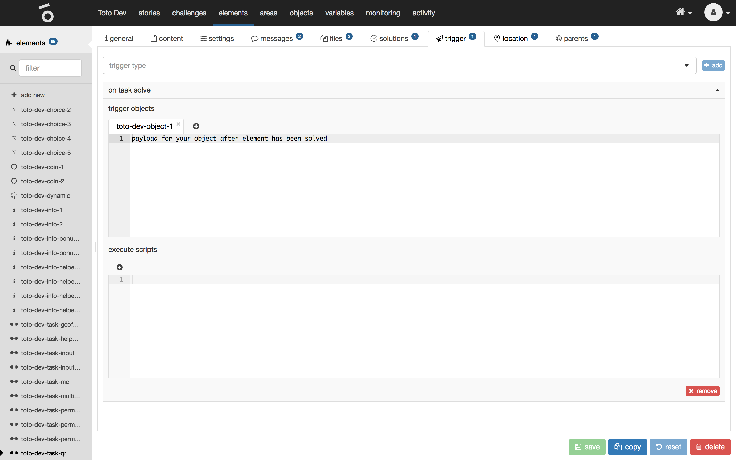
To add a new trigger type select one from the list at the very top and click on the button add.

To add a new trigger click on the + button within the trigger type section tabs, select an TotoObject and define the payload.
Types
| name | description |
|---|---|
on [task/info/choice/dynamic] release |
Fired when an element has been released. |
on task solve |
Fired when a task has been solved. |
on task skip |
Fired when a task has been skipped by the user. |
on task error |
Fired when an task has not been processed correctly. |
on info acknowledge |
Fired when an info element has been acknowledged. |
on coin collect |
Fired when a coin has been collected. |
on choice choose |
Fired when a choice has been made. |
on dynamic success |
Fired when a dynamic element has been processed (can be fired multiple times). |
on dynamic error |
Fired when a dynamic element has not been processed correctly. |
manual |
Fired when the user sets off a manual trigger. |
Location
The location tab of a selected element shows the following properties:
| name | type | description |
|---|---|---|
GPS coordinates |
geolocation |
This represents the physical location of the element. |
show on release |
check |
Defines if the element is shown on the map after being released immediately. |
description |
multi-language markdown |
Description of the element which on the map is shown if the element is selected by the user. |

Parents
The parents tab of a selected element shows where the element is used.
